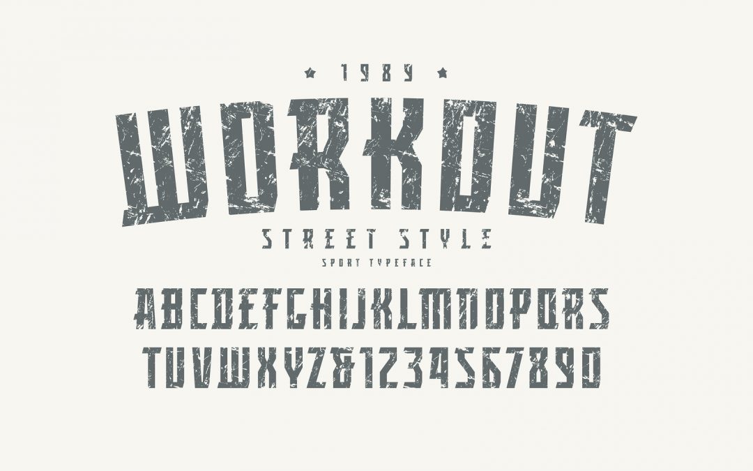
When you’re launching a new website, logo design will probably be one of the first steps you get your Surrey based designers to tackle. You may have some ideas of a style, which you can discuss with your designer, but giving a brief about the tone of voice your business has is a great first step in us interpreting the sort of font to begin working with.
At present, many brands have turned to modern, sleek sans-serif fonts. If you’re not sure what that means, a serif refers to the little flourishes on the end of some letter strokes. Sans, which means ‘without’ in French, so a sans serif font has none of these flourishes. A serif font, for example, would be the likes of Times New Roman, while a sans serif example would be Arial.
In modern times, when a brand has a re-design, it has often been from a serif font to a sans serif – take Google for example. A serif, arguably has more character, however, preference has been put onto sans serif fonts for one big reason. Digital readability.
However, it’s arguable whether that’s really the case. With screens more advanced than ever before, relying on a sans serif font for legibility reasons is a reach, especially when serif characters can be rendered is as little as seven pixels.
Serif fonts can add real warmth, charm and personality to a logo, and in what LogoLounge are calling the ‘Serif-Redux’ trend, more designers and brands are coming back to these fonts for logo designs.
According to LogoLounge founder Bill Gardner, who, with his team, studied over 250,000 uploads to their design library, it’s a natural reaction to the ‘glut’ of sans serif logos that have become the mainstream for brands: “I look at the resurgence of detail as a rush to fill the void created by the push to anonymity that was a result of stripping brands to their visual bone,” he told to Quartz. “You are starting to see the near rebellion of a group of designers that have been on a fat-free diet too long. Mouths are whetted for an opportunity to binge.”
One, perhaps unlikely, source of inspiration for brand designers, according to Gardner, is the hit Netflix show Stranger Things, which throws back to retro graphics from the 1980s. He believes the cultural impact of the show is undeniable, and the logo in particular sets the tone in a powerful demonstration of what serif fonts can achieve. While sans serif fonts are all about modernity and the future, in this way, serif fonts are about nostalgia and stories.
For technology, medicine and science-based brands, sans serif fonts have and continue to be the right choice, but for brands looking to make a human connection and engage, serif fonts may be the better foot forward. Instagram, for example, has stayed committed to its serif, joined up font – aligning itself not as a technology brand, but one focused on human connection.


